Since the coronavirus (COVID-19) outbreak in December, journalists have played a very important role in informing the public about the global pandemic. The Berliner Morgenpost created an interactive map that shows the current spread of the virus all over the world.
Up-to-Date Map from Berliner Morgenpost
In the middle of January, when the coronavirus hit the European continent, the data team from Berliner Morgenpost created an interactive map showing the current state of the pandemic in each country.
Diagrams show the constantly updating figures of people who are confirmed infected, cured, or died from the virus.
The charts are dynamically updated as new information is constantly flowing in. The data is sourced from Johns Hopkins University CSSE, which aggregates it from WHO, CDC (USA), ECDC (Europa), NHC, DXY (China) and Meldungen der Deutschen Behörden.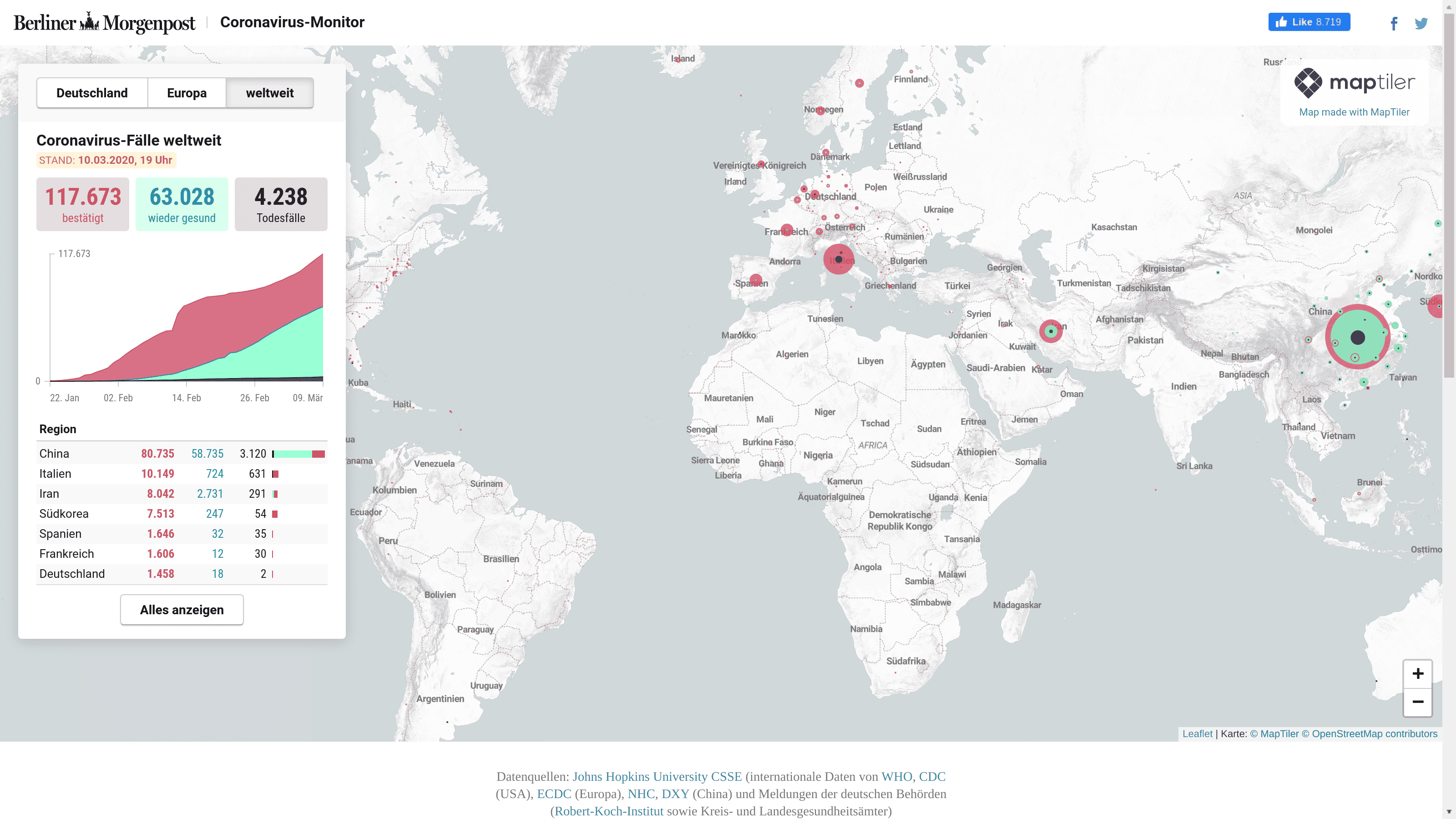
Supporting the Public Good with MapTiler
This map was originally intended just for regular readers of the newspaper. However, due to its quality, the map has become widely popular and shared extensively on social media. Traffic swiftly increased by a factor of 1000s, as the project went viral.
The MapTiler team has decided to support the Berliner Morgenpost project with a generous custom deal. The Berliner Morgenpost team is providing a service in the public interest and it is MapTiler’s duty to help on this mission.
In these times, please follow your governments’ instructions to keep you, your loved ones, and the vulnerable groups safe.